In the realm of web design, CSS image effects are a powerful tool for enhancing user experience and making your website visually captivating. By employing various CSS properties and techniques, you can add interactive elements that engage visitors and leave a lasting impression.
Here are 3 really simple effects you can deploy to your site.
Set-up
To begin, you will first need to add some images on your webpage. We will be using HTML image containers:
The grayscale to colour hover effect is a timeless classic in web design, particularly ideal for photography portfolios or any website where visuals take centre stage. This effect presents images in grayscale by default, but upon hovering, smoothly transitions them back to their vibrant, full-colour state.
Why Use Grayscale to Colour Hover?
Displaying images in black and white offers a clean and contemporary aesthetic, aligning well with minimalist design principles. However, when a visitor interacts with the image by hovering over it, the effect reveals the true colours, adding depth and engagement to the browsing experience.
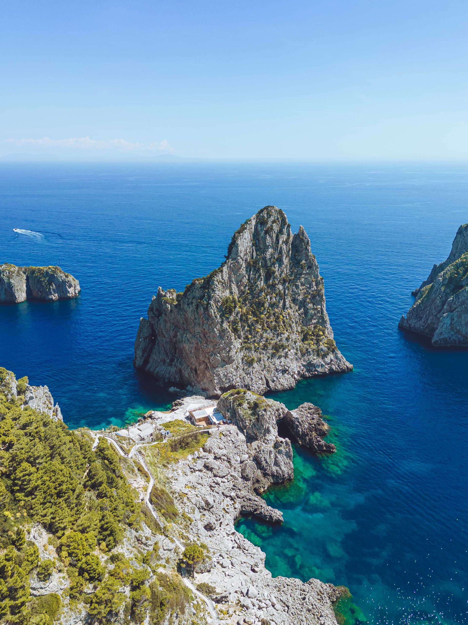
Try it with the images below:
To add this effect to your images, include the following CSS, making sure to update the selectors to match your HTML set up.
In this code, the image is rendered with a grayscale filter. The :hover selector removes the filter to restore the colour. The transition property ensures that this happens smoothly.
Scale on hover effect
The scale on hover effect is a classic technique that adds an element of interactivity to image galleries, making it ideal for websites with dense image layouts. When applied, this effect enlarges images upon hover, allowing visitors to get a closer look at the details without cluttering the layout. Despite its simplicity, the scale on hover effect adds elegance and sophistication to your website's design, enhancing its overall aesthetic appeal.
Why Use Scale on Hover?
By enlarging images on hover, you provide visitors with a more immersive experience, allowing them to appreciate the finer details of each image without the need for additional clicks or pop-ups. Interactive elements encourage engagement and interaction with your website, ultimately leading to a more positive user experience and potentially longer visit durations.
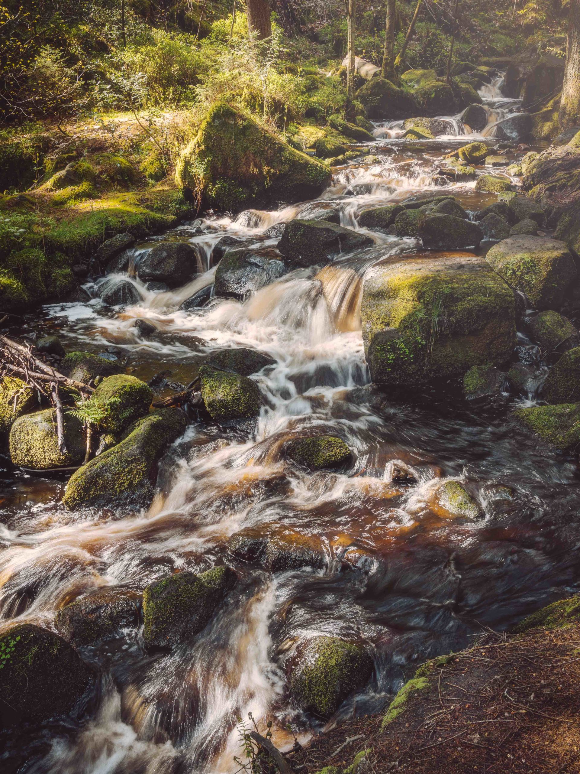
Try it with the images below:
To add this effect to your images, include the following CSS, making sure to update the selectors to match your HTML set up.
In this code, the image is rendered normally. The :hover selector increases the image scale by 1.5. The transition property ensures that this happens smoothly. You can adjust the scale amount or transition time to suite your needs. Remember to throughly check how the elements interact with the rest of your webpage and add other declarations to solve any issues.
Image Flip Effect
The image flip effect serves as a captivating addition to any website, providing users with the ability to flip an image and uncover its hidden side. This interactive feature not only injects depth and allure into your website's design but also amplifies user engagement. The reverse side of the image can contain various elements, including another image, textual information, or direct links to ordering pages, among others.
Why Choose the Image Flip Effect?
The image flip effect transcends mere visual appeal; it serves as a conduit for interactive storytelling on your website. Through a simple hover or click, users can effortlessly flip an image, unveiling the hidden back side. This element of surprise and curiosity compels users to delve deeper into your content.
So, what's happening in this code? Well, we're using the power of flexbox to neatly arrange our images in a row, with just the right amount of space between them. Each image is housed within a "flip container," which is where the real fun begins.
Behind the scenes, we're using CSS transitions and transforms to make the flipping action smooth and seamless. The rotateY transform does the heavy lifting here, giving that satisfying flipping effect.
Incorporating these CSS image effects into your website will elevate its visual appeal and user engagement. Experiment with different configurations, tailor the effects to match your brand aesthetic, and watch as your website becomes a dynamic canvas for storytelling and interaction.